


You don’t need to be a seasoned data scientist or have a degree in graphic design in order to create incredible data visualisations.
Via Baiba Svenca
Get Started for FREE
Sign up with Facebook Sign up with X
I don't have a Facebook or a X account


 Your new post is loading...
 Your new post is loading...
Your new post is loading...
You don’t need to be a seasoned data scientist or have a degree in graphic design in order to create incredible data visualisations. Via Baiba Svenca 
|

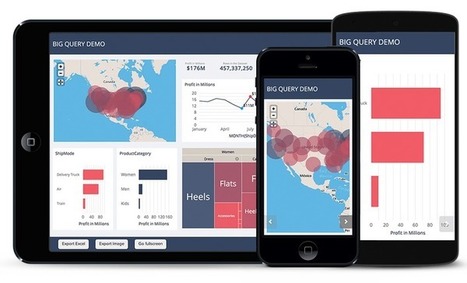
Tired of sending out the same old static PDFs, spreadsheets or links from Google Docs?
Via Baiba Svenca

Baiba Svenca's curator insight,
September 29, 2014 1:51 PM
Silk is a cool tool for publishing your data online and make them interactive. Upload images, tables, videos, maps, spreadsheets, and create visualizations that can be embedded on other sites. Silk lets you collaborate with others. At present Silk account, either individual or team, is free. 
Miguel Paul Trijaud Calderón's curator insight,
October 1, 2014 1:31 AM
Silk - Present your KPIS and figures. Export the data from your spreadsheet automatically. |


Ca donne envie d'essayer : nuage de mots, graphiques, cartes... Par Christopher Ratcliff @ Econsultancy publié le 25/02
Check out how to add visualisations to your presentations.
197